How I turned "where do I click?" into "I want this event"
Redesigning Berlin's creative community platform and proving it with data


Overview
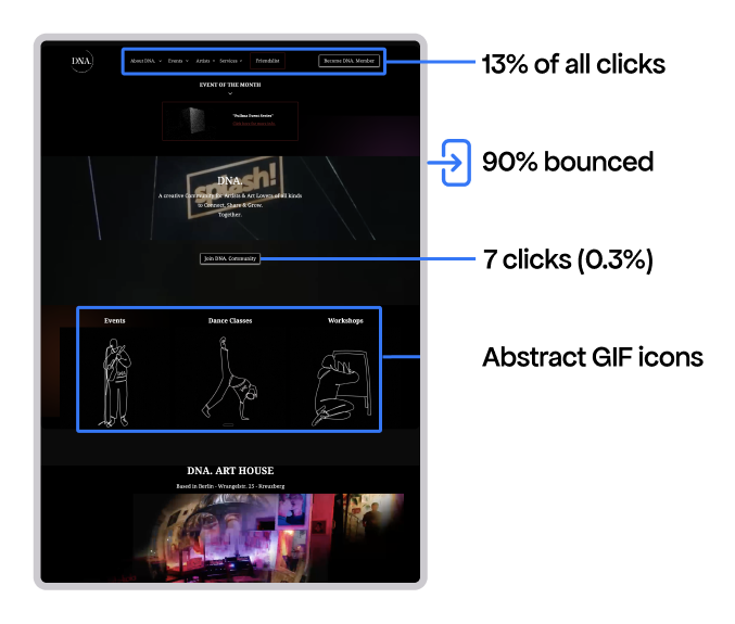
"Why is everyone clicking the navbar?"
13% of all clicks were in the navbar. The reason can be because of 3 broken things:
1. Abstract icons didn't read as buttons. The animated GIFs for categories (dance, poetry, workshops) had no visual indication that they were clickable.
2. No events on the homepage. Users had to imagine what "Dance" or "Poetry" actually meant. No photos. No dates. No reason to click.
3. Black empty space was a link; artist descriptions expanded on click without any cue.
The content existed — users just couldn't find it
DNA had 20+ workshops, 15+ dance classes, 5+ shows happening. The homepage pointed to content instead of showing it.
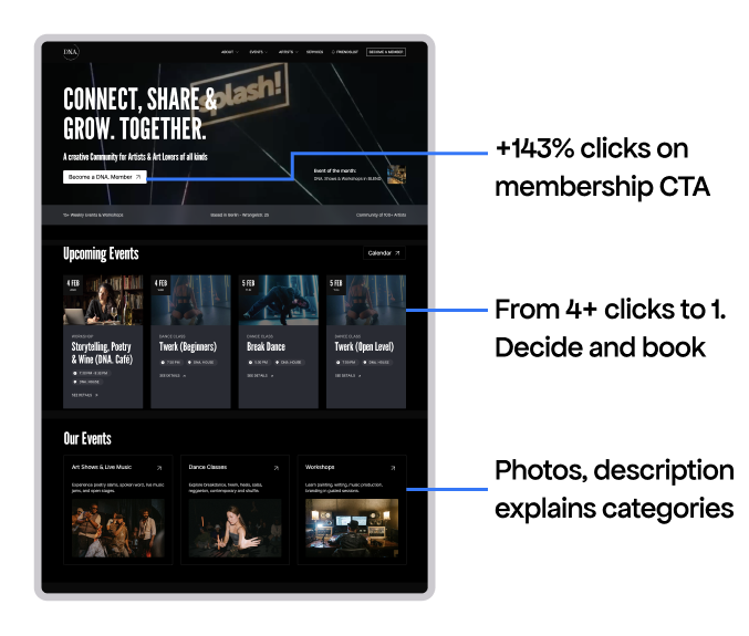
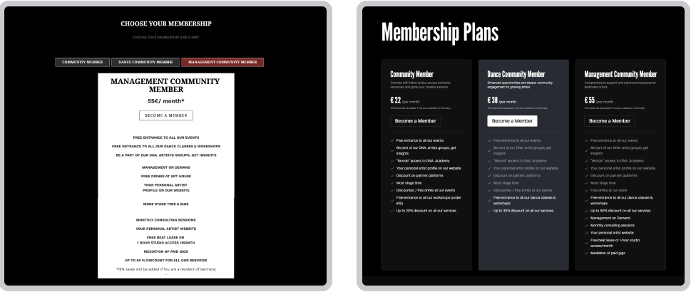
Membership: design clarity, not more buttons
The CTAs got lost in visual clutter. No need to add more buttons, but to make the existing ones visible.
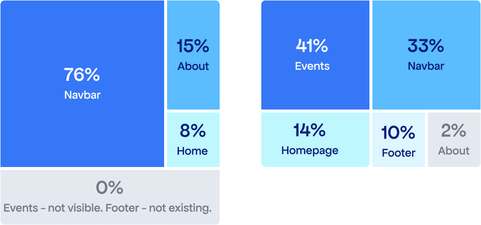
1. Where clicks came from
Old site: 76% of membership clicks came from the navbar alone.
New site: Balanced across 5 touchpoints. Event pages now drive 41% — the link existed before, but better visual hierarchy made it visible.
2. Removing exploration friction
3. Better design clarity — higher conversion
The "Become Member" conversion rate jumped from 4.4% to 10.4% — a +137% improvement.
Event pages needed a clearer path to booking
"Save Your Spot" became #1 clicked element. Events traffic increased up 240%."
What "cleaning up" achieved
Learnings
AI as a design assistant and design manager. I used AI for prototyping, troubleshooting Webflow issues, and analysing analytics for this case study. What might have taken 9 months became 3.
Technical growth. Before this project, Webflow CMS intimidated me. Now I've restructured complex CMS collections, added custom code for styling and interactions, and solved limits with Finsweet attributes.